Color is the most subconscious element of visual storytelling. Before a viewer processes the subject of your photo, their brain registers the color palette. It sets the temperature of the room, so to speak. Is this a safe place? Is it melancholy? Is it dangerous?
Many new photographers use color grading as a band-aid—slapping on a preset to "fix" a boring image. But true color grading starts before you even take the shot.
The Psychology of Hues
Let's break down the emotional weight of the primary cinematic colors used in my work:
- Green (Acidic/Deep): Often associated with nature, but shift it towards acid/neon and it becomes unsettling, matrix-like, or hyper-modern. This is the accent color of this website for a reason—it signals "digital tech" meeting "organic growth."
- Blue (Teal/Cyan): Cold, isolation, calm, or technological. In my "Urban Grit" series, I often push shadows towards teal to evoke the cold steel of the city.
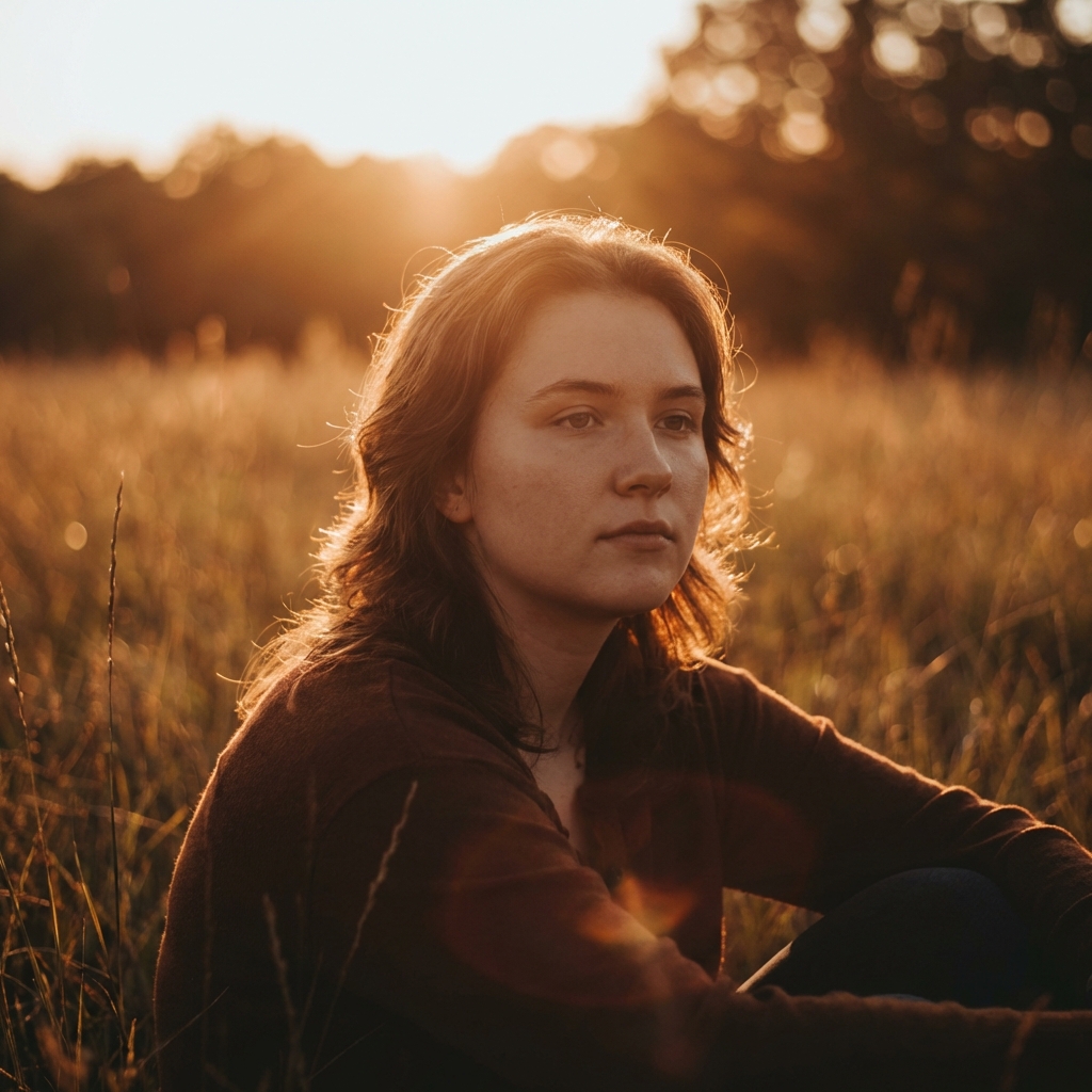
- Orange (Amber/Gold): Nostalgia, warmth, fleeting moments. The "Golden Hour Soul" collection relies heavily on preserving these tones without letting them become muddy.

The 60-30-10 Rule
Interior designers use this rule, and it applies perfectly to photography color palettes.
- 60% Dominant Color: Usually your background (shadows/midtones).
- 30% Secondary Color: Your subject or key elements.
- 10% Accent Color: Small pops of contrasting color (a taillight, a neon sign, eyes).
If your image has equal amounts of red, blue, green, and yellow, it feels chaotic. Restraint is the key to cinematic color. You must be willing to desaturate the colors that don't serve your story.
"A great color grade isn't about what you add. It's about what you take away."
Creating Your Own LUTs
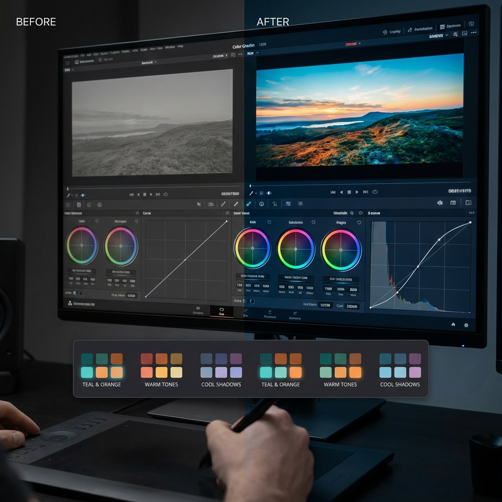
When I build a Look Up Table (LUT) for a series, I start by normalizing the image. Then, I use the Split Toning (Color Grading) wheels to inject the mood. A favorite technique of mine is to lift the blacks slightly and infuse them with a deep blue, while tinting the highlights with a soft cream (not pure yellow). This creates that vintage, filmic look that feels timeless.
